Website V1: Bootstrap All the Things
The summer of 2015 was the summer between my sophomore and junior years at the University of Tulsa. I had taken a few programming classes by that point, and was drawn to web development. To prove to myself that I knew my way around the basics, I wanted to build a personal website – I didn’t have a plan for it, but I knew that I wanted it.
Most recently, I had learned about a tool called Bootstrap. Everyone and their mother was raving about Bootstrap. In 2015, it sounded like the end-all be-all for responsive web design. Spoiler: it wasn’t. But I, a young and impressionable college student, Bootstrapped the ever-loving heck out of version one of my website.
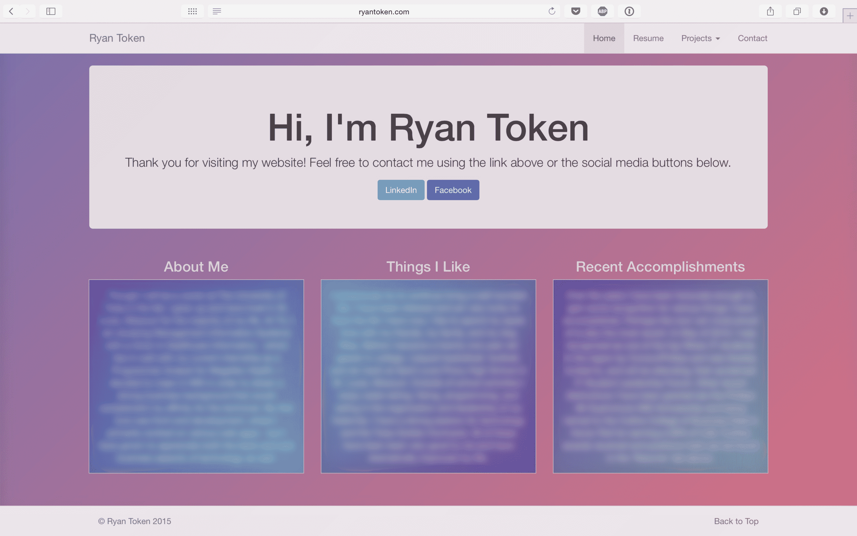
See for yourself: (most text blurred out for my own privacy)

You don’t get much more Bootstrappy than that.
There are several items there that scream Bootstrap (and inexperience) if you know what you’re looking for.
What screams Bootstrap? If you’re familiar with it at all, you’ll probably notice them immediately. The header, the Jumbotron (or Hero Unit, as Bootstrap now calls it), the three-column layout, and the footer.
All four of those items are classic, vanilla Bootstrap with very few modifications. Remember – in 2015 I was a bona-fide noob in the world of web development. I had no idea what I was doing. Bootstrap was awesome, and in some ways still is. It solved a lot of problems for a fledgling web developer.
Also, apparently CSS gradients were the greatest things I’d ever seen, as I threw different variations of them wherever I could fit them.
But hey, this was the first website I had built completely on my own. I had no input from a boss, teachers, or fellow students. I was, and still am, proud that I built it. I learned a lot that I wouldn’t have learned otherwise, it helped solidify my love of web development, and when all was said and done, there was a product out there that the world could see.
Iterations
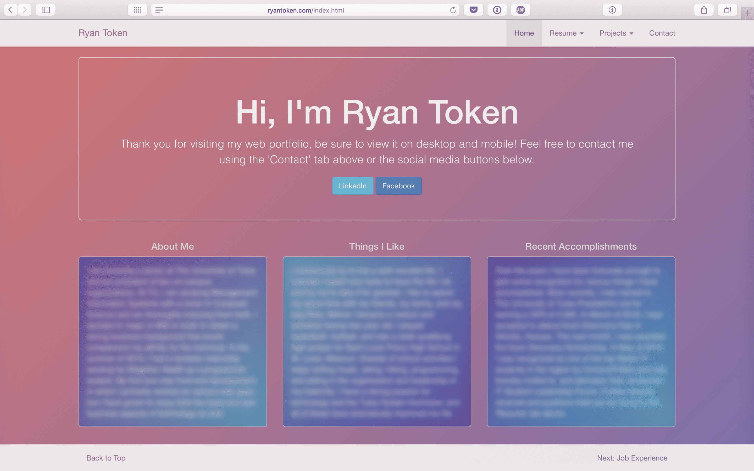
So that was 2015. Until this complete rebuild in March of 2020, it stayed more or less the same for the next several years. It did go through a couple of design refreshes over that time, though.
Notably:

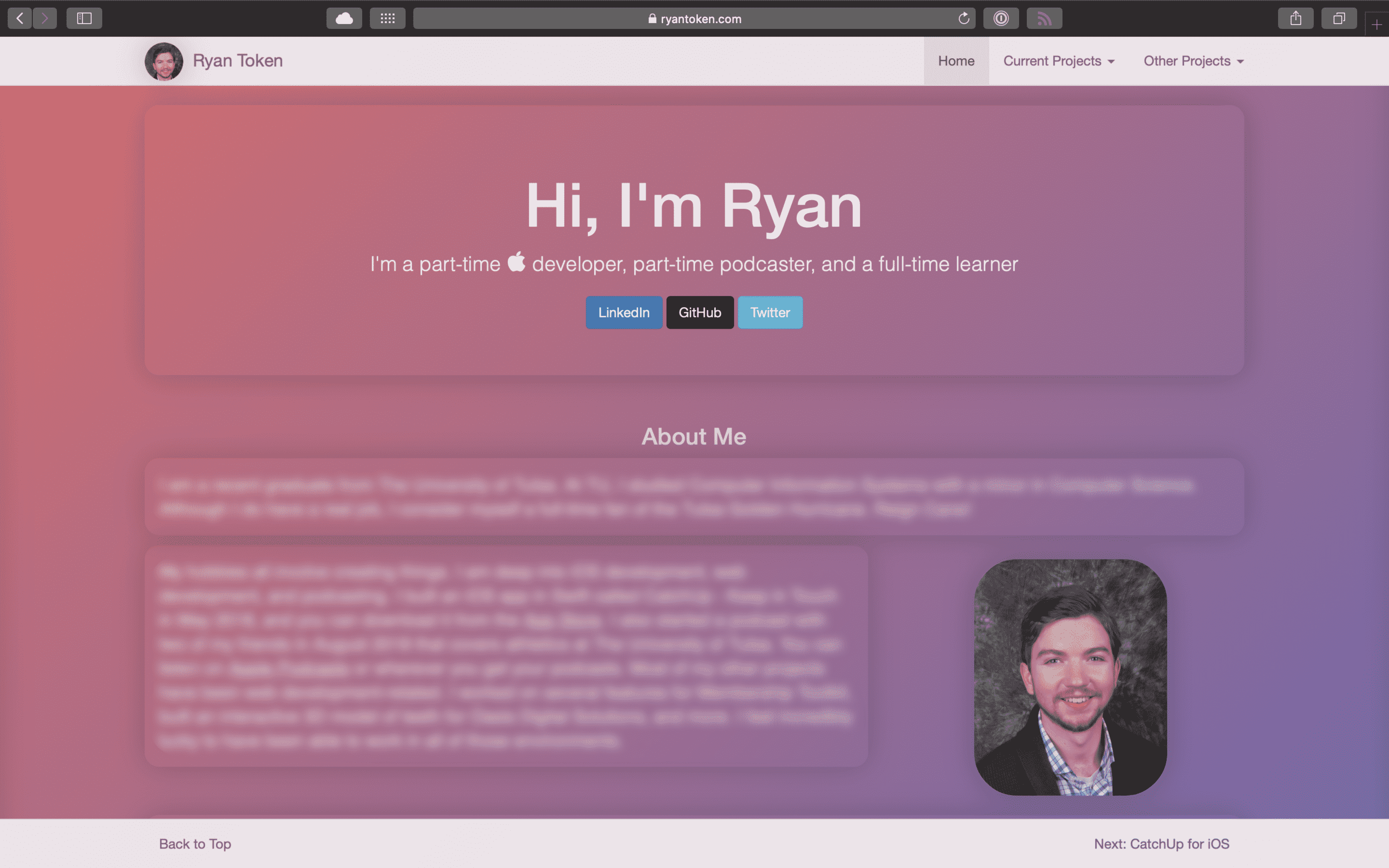
And then:

In the first of those two design refreshes, I got my feet wet with transparency, and added some dynamic functionality to the footer that let you navigate the website page-by-page from there.
The second is how the website looked the day before I published the rewrite you’re reading this on now.
I finally got rid of those blue-teal gradient boxes, left the three-column layout behind, added some dimensionality and pictures, and significantly simplified the codebase.
However, after five years of the same basic layout, it was time for a complete re-think of my website. The previous site felt stale and I didn’t enjoy working on it or adding to it as much anymore. More than anything, though, was the fact that I’m out of college now.
The previous site was very much focused on me, my resume, and my portfolio of projects. I no longer felt that I needed as much of a ‘resume’ site. My mindset has shifted dramatically since college, and so my website needed to shift dramatically along with it.
Considering My Options
I knew I wanted to completely recreate the website with modern developer tools and a system that would be easy and fun to iterate on. I did not know, however, what exactly I’d be using to kick this off. To help narrow those options down, I listed out my goals for the site:
- It should have a blogging component
- It should be fun for me to work on and add to, instead of feeling like a chore
- It should be built with a modern language and toolset
- It should not look like every other personal website out there
I’ve added several new skills to my personal toolbox since 2015, my favorites of which are React and Swift I use React for most of my web projects, and Swift and SwiftUI for native iOS projects.
On the side, I run a podcast and blog covering University of Tulsa athletics. As part of that, I built our website with React. That was my first React project, and you might see some similarities to the screenshots above. That’s because, more for comfort than anything, I used React Bootstrap to create the front-end. It’s basically Bootstrap rebuilt for use in a React environment. It was easy to pick up due to my familiarity with Bootstrap, and I liked it, but I’ve since been using Material-UI for React projects.
I wrote a blogging engine with React as part of that project, and my first inclination was to reuse the skills I had picked up from that. I would’ve gone with Material-UI instead of React Bootstrap for the front-end design, but I could have reused a lot of the rest. That would have been the easier way for me, and I strongly considered that option.
Contrarily, I’ve been pretty deep into iOS development since 2017. I taught myself Swift, released my first iOS app in May of 2018, and have several more that I’ve worked on locally but haven’t released. Let me be clear, I really enjoy writing code with Swift. The type-safety, readability, community, and plenty more made it incredibly fun to learn.
I’ve long wanted to build a website with Swift, but was never fully satisfied with the available tools. I’ve toyed around with server-side Swift frameworks like Vapor and Kitura, and found both to be capable but overly-complicated solutions for what I wanted.
And then I found Publish. Publish is an open-source “static site generator for Swift developers” built by John Sundell. John is a former lead iOS developer at Spotify who now runs his own company called Swift by Sundell that is, naturally, all about Swift development. Publish was open-sourced in December of 2019, and all of Swift by Sundell is built with Publish.
A Full Redesign – Zero JavaScript
I cloned Publish from GitHub to familiarize myself with it for a few days, and was hooked. I decided that this was the best (and most fun) answer.
Publish was exactly what I was looking for. It lets you build and configure your entire website with Swift and Markdown, nearly everything is customizable, and it comes with native support for blogging built in. It also supports custom themes, plugins, and a host of other powerful options.
There is zero JavaScript throughout the entire site. This doesn’t attempt to solve the Thirty Million Line Problem, but it does mitigate the bloat of JavaScript Framework Hell. Long story short, front-end JavaScript frameworks come with a LOT of bloat, most of which will never be of use to you. Getting rid of all that code speeds up load times significantly, hopefully you’ll notice that while navigating my site.
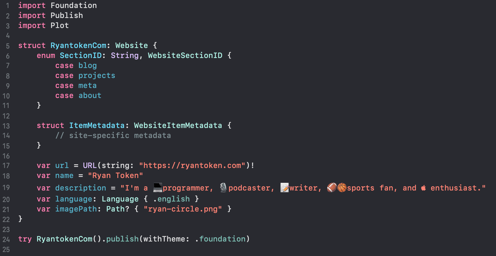
The main Swift file to build a site with Publish is incredibly simple to understand. Here’s what mine first looked like:

First, there’s an enum called SectionID. This is where you describe what sections your website will have. Mine are the four main tabs at the top of the page: Blog, Projects, and About.
Next, there’s a struct called ItemMetadata. This is site-specific metadata which we’ll be able to use in a fully type-safe manner all throughout our publishing process. I don’t have anything in there at this point because, honestly, I don’t know what benefit it would give a site as simple as mine.
And finally, there are five variables that finalize some information for the website. The last step is the try statement that actually calls on Publish to generate the HTML and CSS files that your browser will serve up to show you this page.
It’s really an incredibly simple layout.
This blog post, and every one that will come after it, are simple Markdown files that the Swift package can reference.
Next Steps
When this post comes out, I will still be using Publish’s built-in theme for the site. However, Publish uses another framework (also built by John Sundell) called Plot that allows for custom themes to be built and used by Publish.
My next goal for this site is to create my own theme and really customize a lot of it. Step one was just to get it the new site out the door.
I’m incredibly excited for the journey that this site will lead me down. I’ve been dying to use Swift for something outside of strictly Apple development, and have also badly wanted to create my own blog. Publish satisfies both of those needs while allowing for as little or as much customization as I’d want or need.
I plan to dive head-first into Plot (Sundell’s theming engine) in the very near future to add some more color, dynamism, and customization to the site. Keep an eye out for changes in that area soon.
Stay tuned! I can’t wait to see how this goes.


